Relato Sans (Eduardo Manso, 2006)
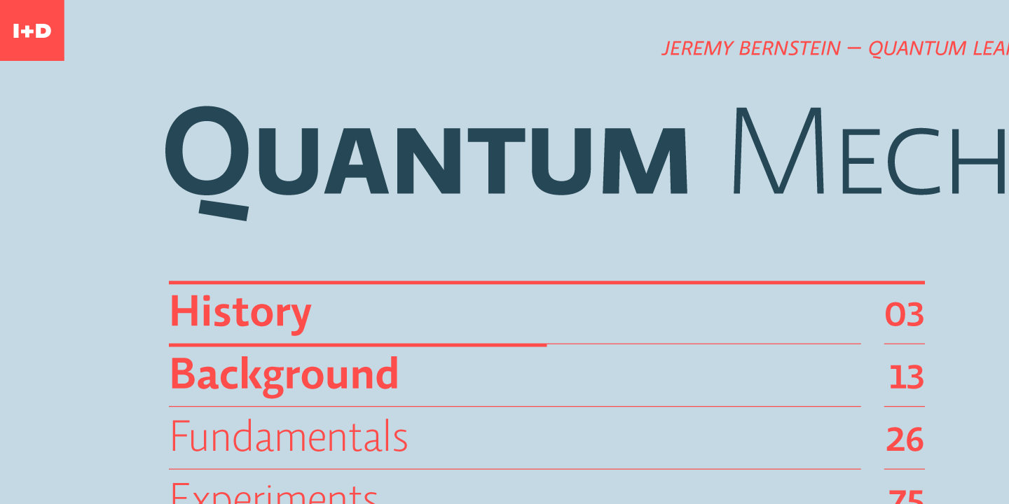
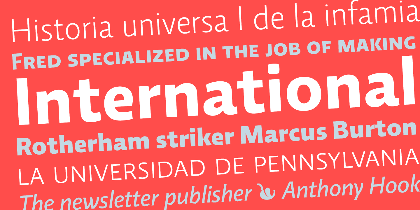
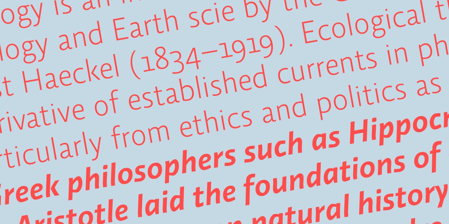
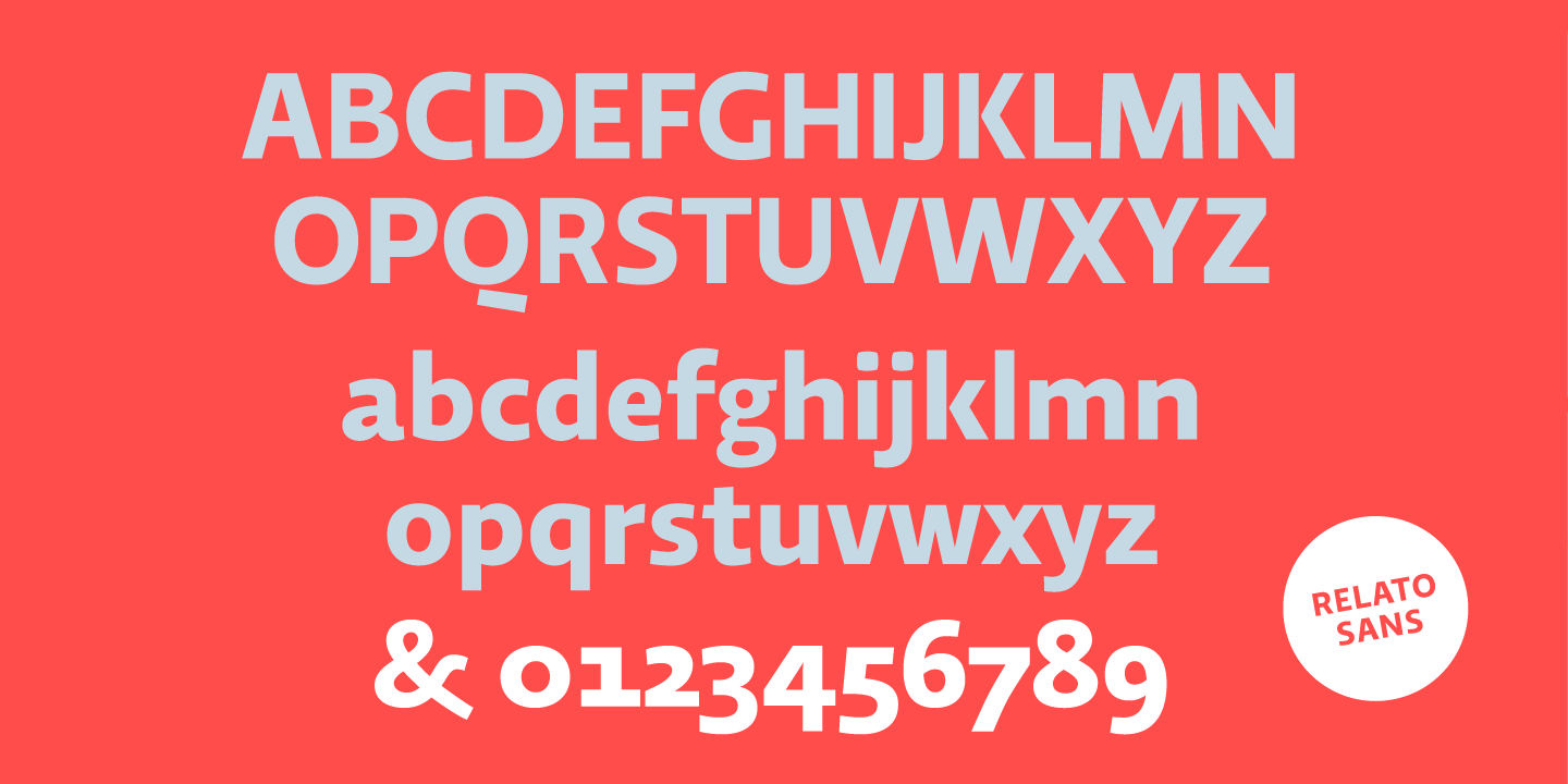
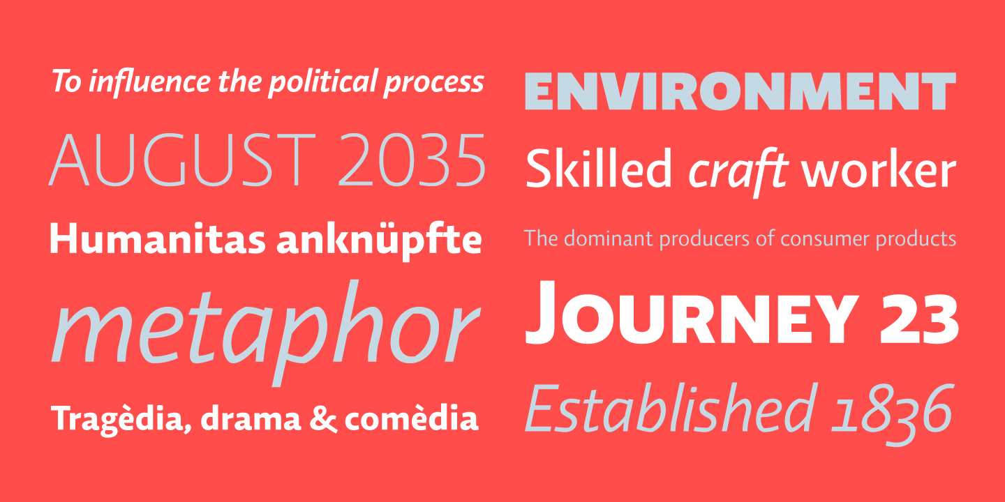
Relato Sans is the other face of Relato Serif (a typeface with a lot of idiosyncrasy) nevertheless, the sans version is more austere and aseptic. A humanistic type, with a contemporary cut, created for general use in texts and headlines and also with a great variety of weights, allowing enough flexibility for projects of great magnitude. Although leading with an independent family it maintains many of the characteristics its homologous such as proportions, the "x" height, the construction based on air lines of the italic, ornaments and so on. These details show coherence with the serif version, reinforcing at the same time its personality. Being a multifunctional type the "kerning" has been worked to function in small sizes as it does in larger ones such has headlines. The contrast between the weights was idealized to be used in pairs (Light with Semibold, Regular with Bold and Medium with Black). Relato Sans is presented in 6 different weights, in Roman, Italic, Small Caps and Small Caps Italic with tree different styles of numerals, Old style figures, Lining figures and Small Caps figures. +INFO
Relato Sans is the other face of Relato Serif (a typeface with a lot of idiosyncrasy) nevertheless, the sans version is more austere and aseptic. A humanistic type, with a contemporary cut, created for general use in texts and headlines and also with a great variety of weights, allowing enough flexibility for projects of great magnitude. Although leading with an independent family it maintains many of the characteristics its homologous such as proportions, the "x" height, the construction based on air lines of the italic, ornaments and so on. These details show coherence with the serif version, reinforcing at the same time its personality. Being a multifunctional type the "kerning" has been worked to function in small sizes as it does in larger ones such has headlines. The contrast between the weights was idealized to be used in pairs (Light with Semibold, Regular with Bold and Medium with Black). Relato Sans is presented in 6 different weights, in Roman, Italic, Small Caps and Small Caps Italic with tree different styles of numerals, Old style figures, Lining figures and Small Caps figures. +INFO