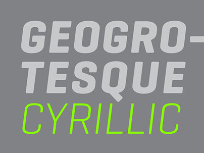
Geogrotesque Stencil (Eduardo Manso, 2009)
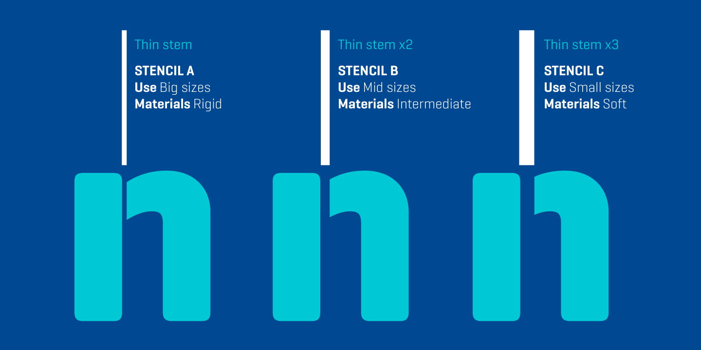
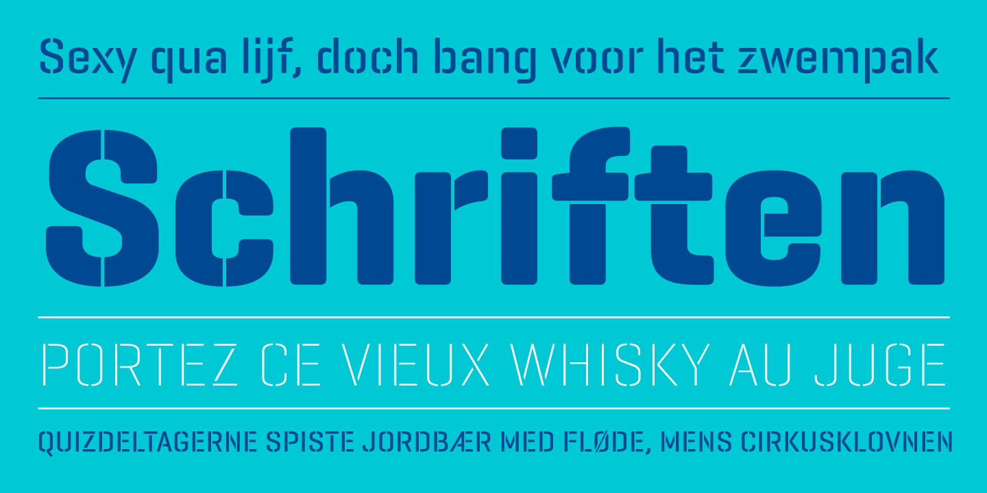
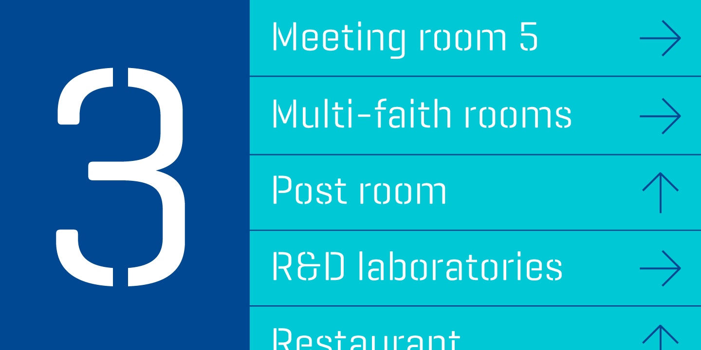
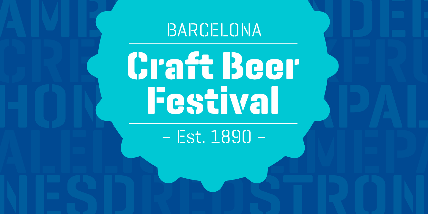
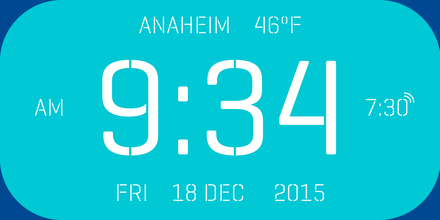
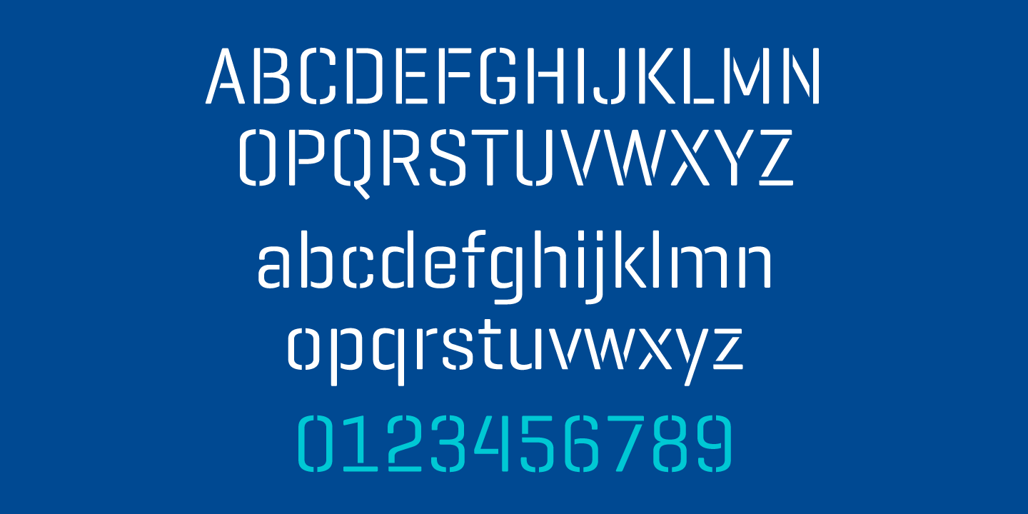
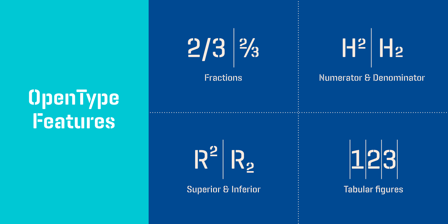
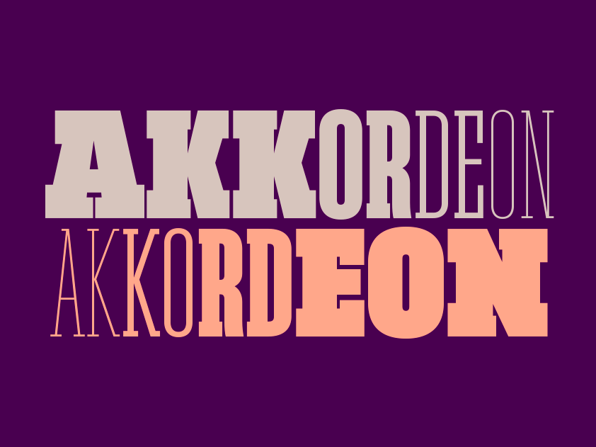
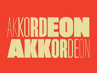
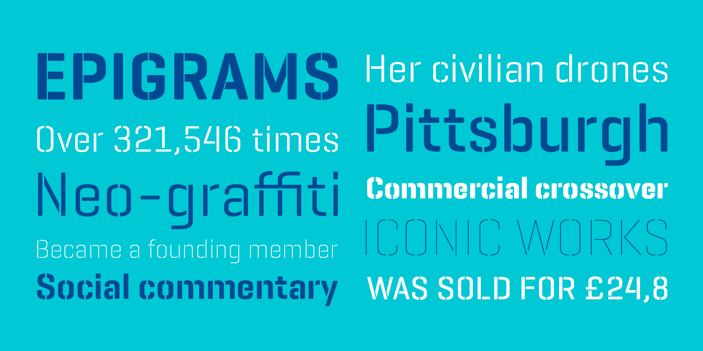
Geogrotesque Stencil is the newest member of the popular Geogrotesque family, it has been thought as a display typeface, but it goes one step further and tries to solve some of the typical problems of stencils fonts.Most stencil fonts don't have a wide range of weights, Geogrotesque Stencil has a range of 7 weights. Another characteristic of this type of fonts is that the cut usually does not adapt well to the size or the use of different materials, generally it has a wide cut that works well in small sizes but in larger sizes is not very elegant, on the other hand a thin cut does not work in small sizes and affects the reading.Geogrotesque Stencil tries to solve these problems with 3 levels of cut (A, B and C). The thin cut (version A) matches the stem width of the Thin weight, in version B is twice as wide and in the version C is three times more wide. The cut maintains the same width through all weights and are not rounded, also other details have been modified for this stencil version, such as the "notch" of the n, a, b, d, p and q, or k where the horizontal arm disappears, these adjustments allow a better functionality of the typeface.The cuts not only allow a better performance when printing at different sizes, but also allow you to use the version A, B or C in accordance to the rigidity of the material you have, for rigid materials use the version A where the cut is more thin and passes unnoticed, while for lighter materials you can use the version C where cuts are wider and help keeping the material more stable.The type family consists of 21 styles, 7 weights (Thin, UltraLight, Light, Regular, Medium, SemiBold and Bold) available in 3 versions (A, B and C) in Open Type format with support for Central and Eastern European languages. +INFO
Geogrotesque Stencil is the newest member of the popular Geogrotesque family, it has been thought as a display typeface, but it goes one step further and tries to solve some of the typical problems of stencils fonts.Most stencil fonts don't have a wide range of weights, Geogrotesque Stencil has a range of 7 weights. Another characteristic of this type of fonts is that the cut usually does not adapt well to the size or the use of different materials, generally it has a wide cut that works well in small sizes but in larger sizes is not very elegant, on the other hand a thin cut does not work in small sizes and affects the reading.Geogrotesque Stencil tries to solve these problems with 3 levels of cut (A, B and C). The thin cut (version A) matches the stem width of the Thin weight, in version B is twice as wide and in the version C is three times more wide. The cut maintains the same width through all weights and are not rounded, also other details have been modified for this stencil version, such as the "notch" of the n, a, b, d, p and q, or k where the horizontal arm disappears, these adjustments allow a better functionality of the typeface.The cuts not only allow a better performance when printing at different sizes, but also allow you to use the version A, B or C in accordance to the rigidity of the material you have, for rigid materials use the version A where the cut is more thin and passes unnoticed, while for lighter materials you can use the version C where cuts are wider and help keeping the material more stable.The type family consists of 21 styles, 7 weights (Thin, UltraLight, Light, Regular, Medium, SemiBold and Bold) available in 3 versions (A, B and C) in Open Type format with support for Central and Eastern European languages. +INFO