Relato Serif (Eduardo Manso, 2005)
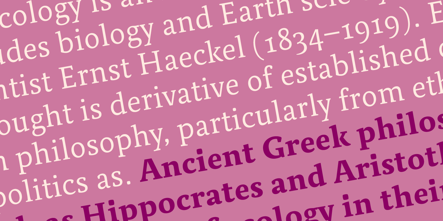
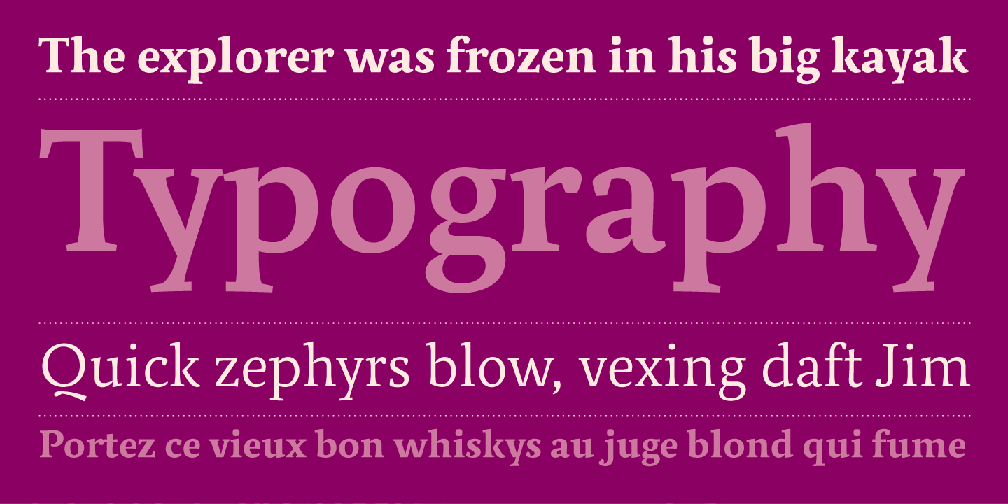
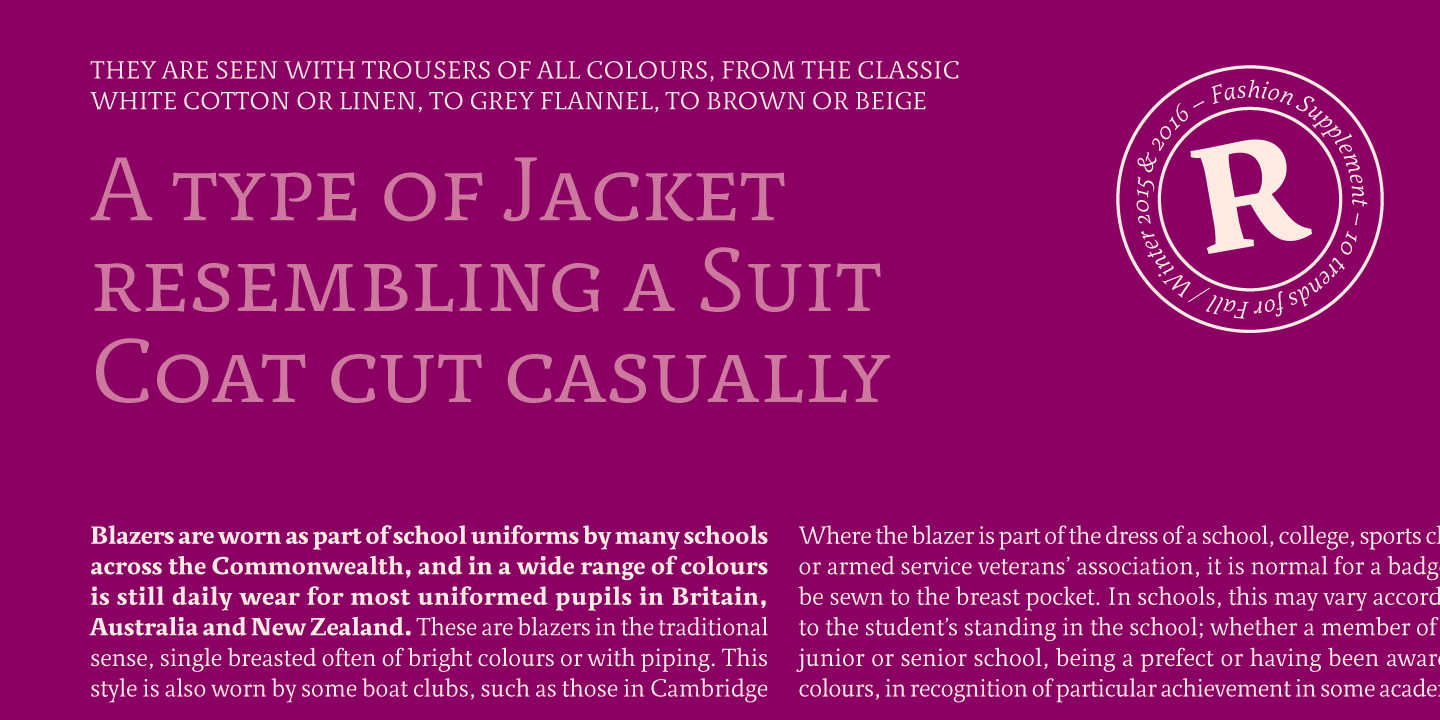
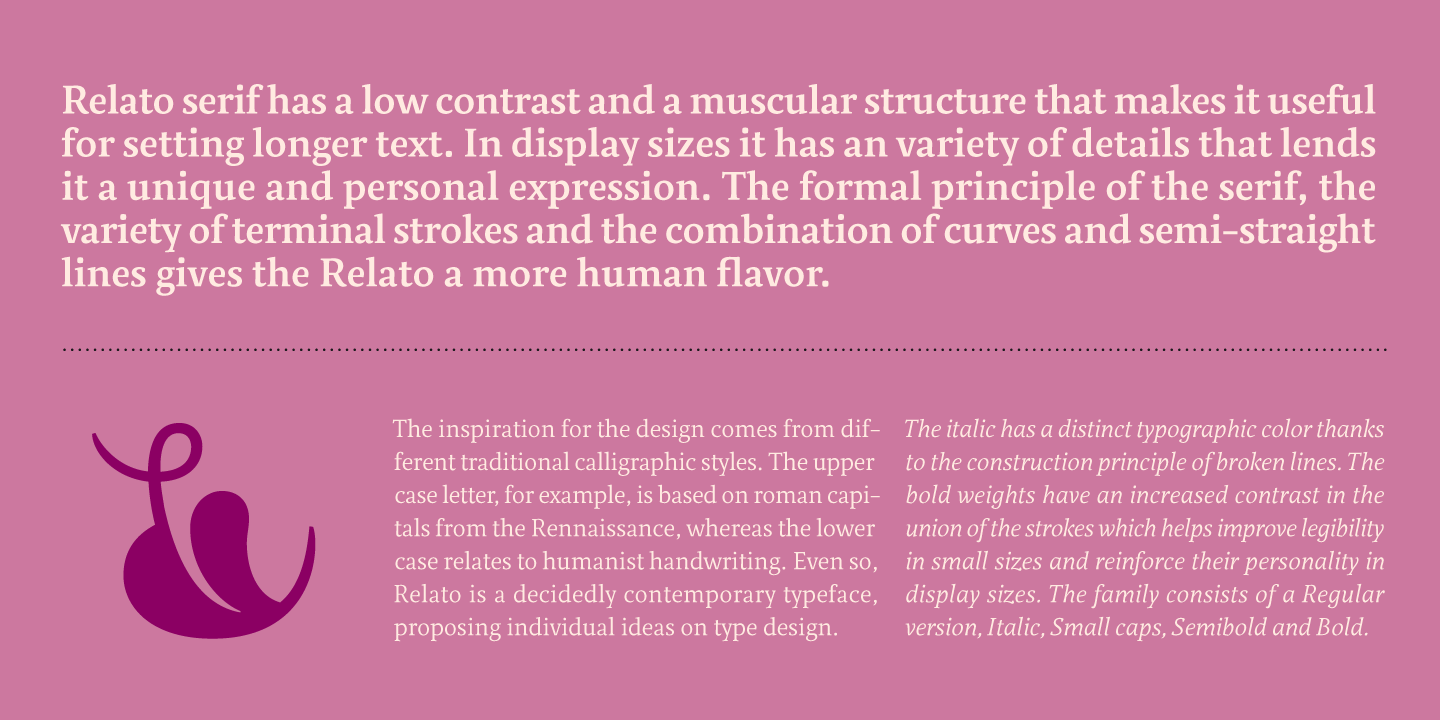
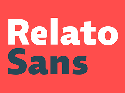
Relato has a low contrast and “a muscular” structure that makes it useful for setting longer text. In display sizes it has an variety of details that lends it a unique and personal expression. The formal principle of the serif, the variety of terminal strokes and the combination of curves and semi-straight lines gives the Relato a more “human” flavor. The inspiration for the design comes from different traditional calligraphic styles. The upper case letter, for example, is based on roman capitals from the Rennaissance, whereas the lower case relates to humanist handwriting... +INFO
Relato has a low contrast and “a muscular” structure that makes it useful for setting longer text. In display sizes it has an variety of details that lends it a unique and personal expression. The formal principle of the serif, the variety of terminal strokes and the combination of curves and semi-straight lines gives the Relato a more “human” flavor. The inspiration for the design comes from different traditional calligraphic styles. The upper case letter, for example, is based on roman capitals from the Rennaissance, whereas the lower case relates to humanist handwriting... +INFO