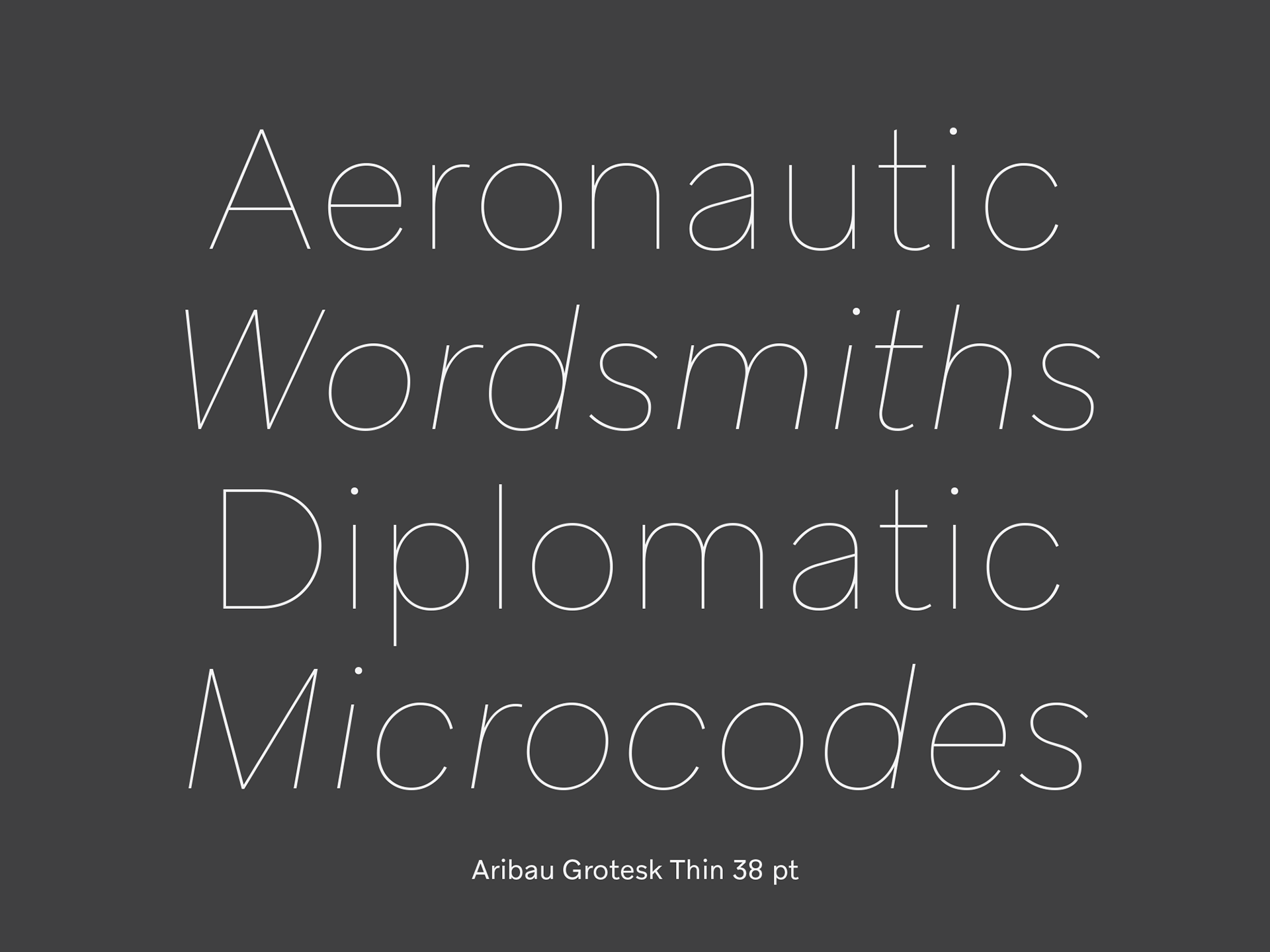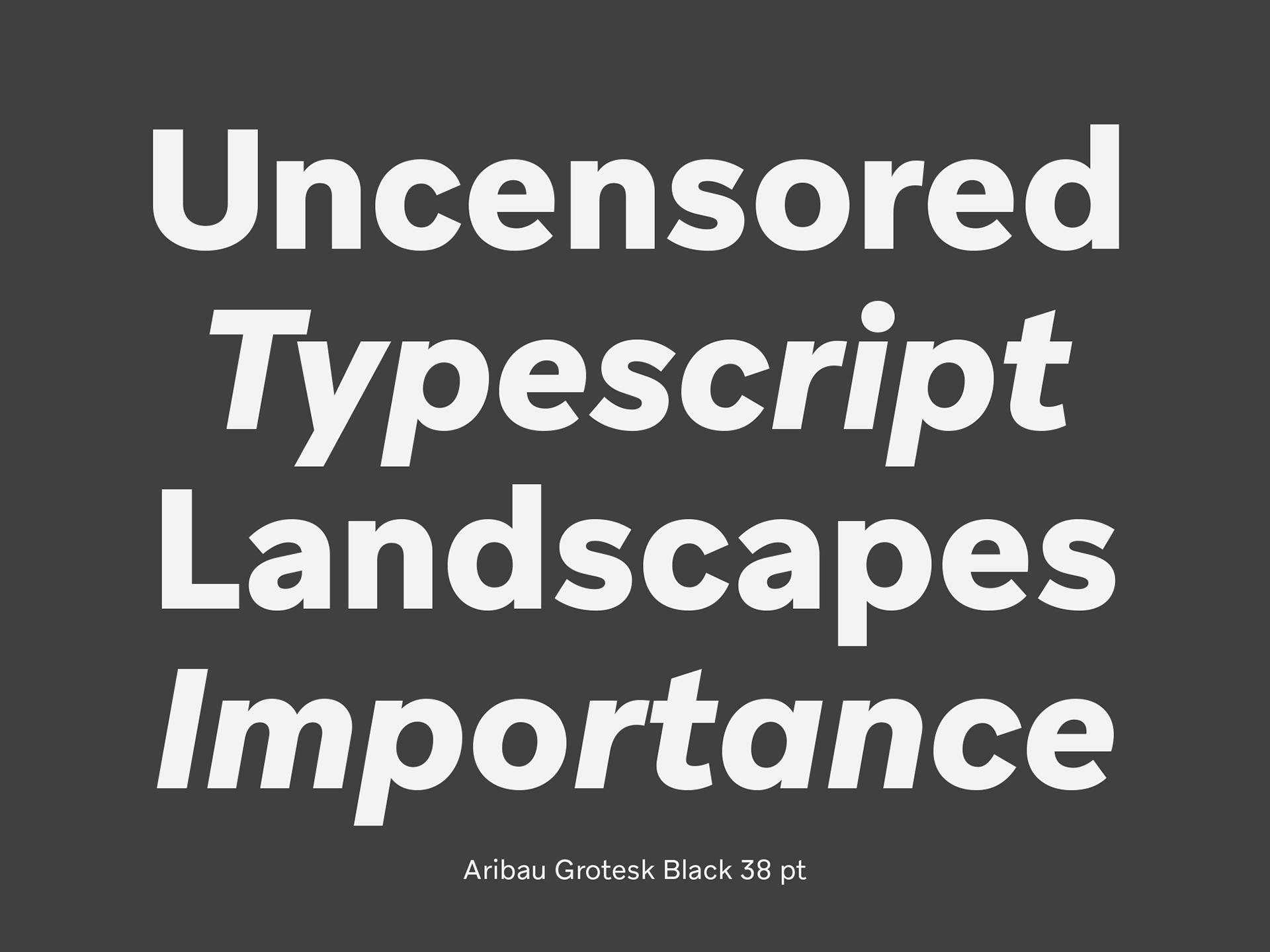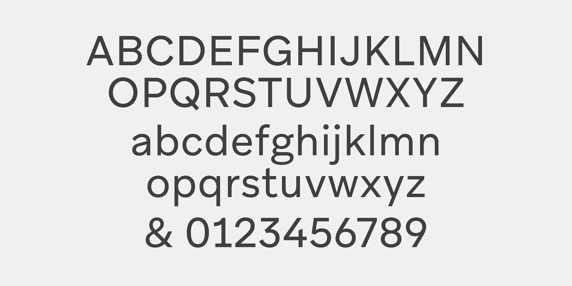
Aribau Grotesk
Eduardo Manso – 2018
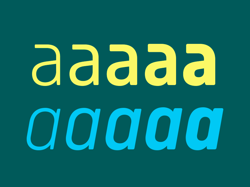
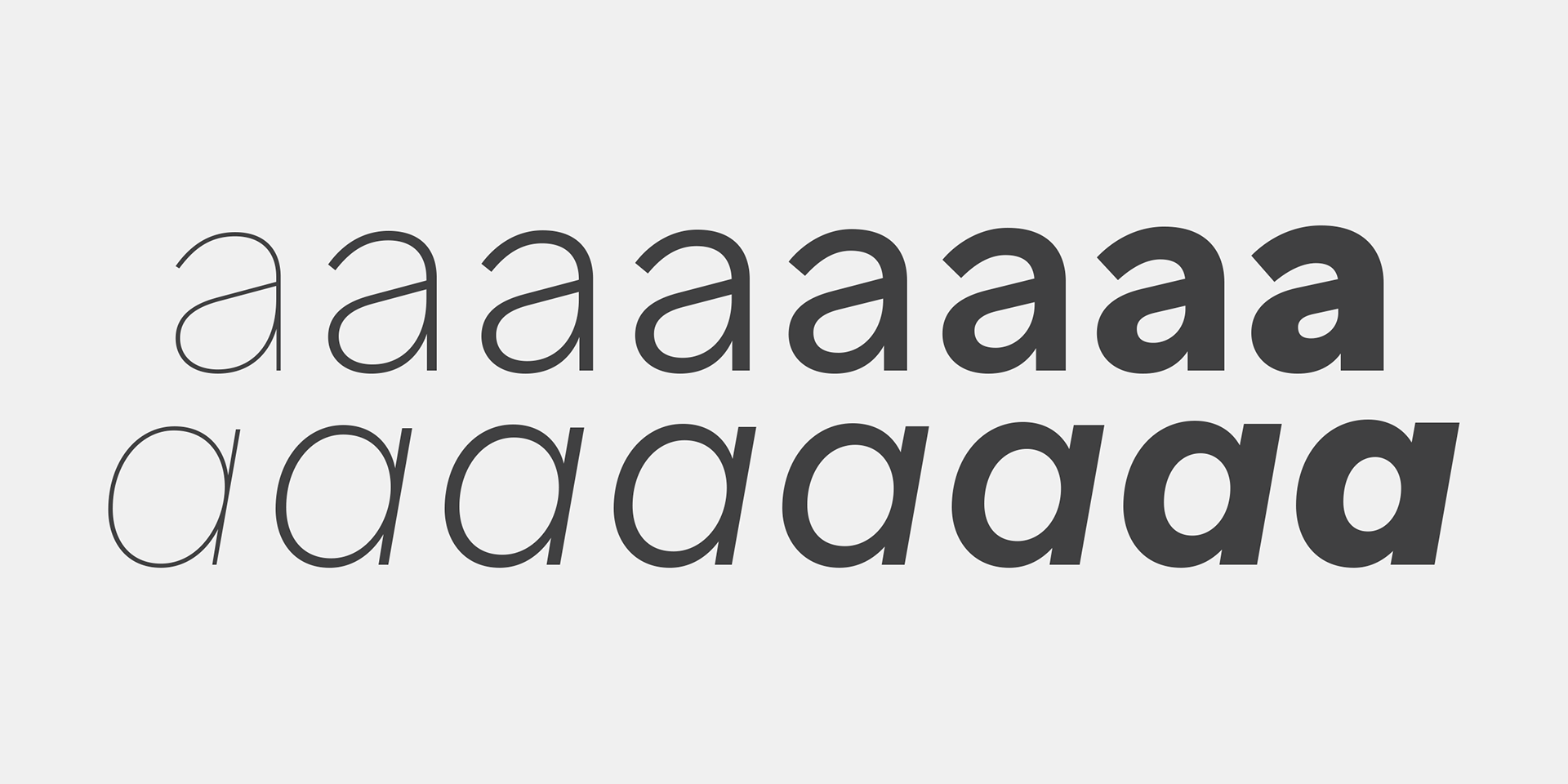
Born from the intersection of the geometric and grotesque typefaces. Aribau Grotesk combines low contrast and generous width proportions with typical traits of american gothics from the early 20th century, like the counters aperture and a double story ‘g’. Driven by the process, some details come from the geometric style arose, like the clean-shaped figures and the circular dots that convey a more affable and contemporary look.